
Article: What is Normalization and How Do We Use It?
Tags
- All
- Training (4)
- Account Management and Security (9)
- Features of Dedoose (9)
- Dedoose Desktop App (1)
- Dedoose Upgrades and Updates (5)
- Dedoose News (6)
- Qualitative Methods and Data (11)
- Other (5)
- Media (5)
- Filtering (5)
- Descriptors (10)
- Analysis (22)
- Data Preparation and Management (20)
- Quantitative Methods and Data (5)
- Mixed Methods (20)
- Inter Rater Reliability (3)
- Codes (26)
As researchers, we believe it is your responsibility to account for as many nuances in your data as possible. This is important to help assure you are reporting reliable and valid findings. One such challenge that many face is when you are analyzing data across multiple groups that differ in the number of members. In Dedoose, we use a normalization procedure, so that when you are looking at charts representing frequencies, the relative size of the bars is meaningful. For example, say we are studying how involved single parents are in teaching their children to read. If we have 30 women and 5 men and we are interested in the time spent on this task, the raw values for the groups will heavily favor the women—that is, all things equal, larger groups will likely show greater amounts of time spent teaching reading (or more of whatever we are studying). Using normalization, we can calculate proportional values and use them to generate metrics or in displaying bars that are adjusted proportionally based on the number of members in each group. Simply, this allows us to visually compare data from groups of differing sizes in relative terms so the metrics or graphs are meaningful.
So, with an understanding of when and why we use this procedure—what is normalization and how do we put it to use in Dedoose?
Normalization is a process that renders variables comparable to each other. This can be done in a variety of ways, but in Dedoose we apply a multiple to each group by a coefficient derived from the largest group in the set.
Let’s look at an example. In the table below, we have 3 groups of varying sizes: 10 people with black eyes, 5 with brown eyes, and 2 with blue eyes.
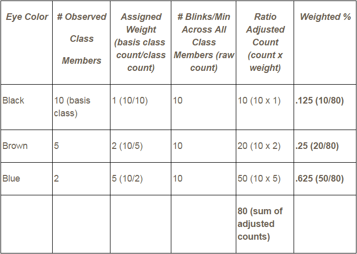
In addition, we have the number of raw blinks per minute for each group. As we can see in the 4th column, regardless of how many members there were in each eye color group, they each totaled to 10 blinks per group per minute. Now, if we were to take the blink counts at face value without the class size context, we might conclude that every person blinks at the same rate. This would clearly be wrong, as the raw data in our example show that the 10 people with black eyes blinked the same number of times as the 2 people with blue eyes.
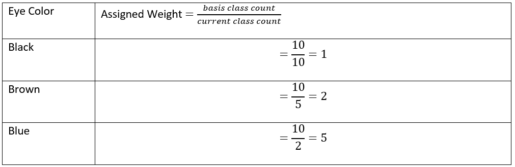
Enter normalization. When we inspect the 3rd column we find a unique weight for each group. The largest group, the basis class, is assigned a 1 and the others are calculated by dividing the basis class count by the specific group’s count. In our example, people with black eyes are the basis class:
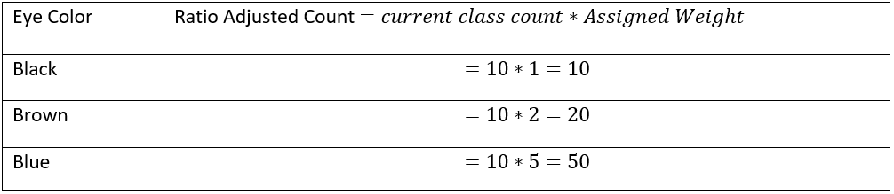
With these calculations out of the way, we can get our Ratio Adjusted Count. This is the number you will see in your Dedoose charts with normalization enabled:
Given these adjusted numbers, we can get a better idea of what our data is telling us. In our example we find that, on average, people with brown eyes blink twice as often in one minute as those with black eyes and blue eyed people blink 5 times as frequently.
Yes, this is a simple illustrative example and we would be ill advised to draw any conclusions about large populations based on such small samples. That said, we hope you found this blog useful.
Happy Dedoosing out there and, as always, feel free to contact us if you have any questions!