
Article: Analyzing Your Open-Ended Survey Data
Tags
- All
- Training (4)
- Account Management and Security (9)
- Features of Dedoose (9)
- Dedoose Desktop App (1)
- Dedoose Upgrades and Updates (5)
- Dedoose News (6)
- Qualitative Methods and Data (11)
- Other (5)
- Media (5)
- Filtering (5)
- Descriptors (10)
- Analysis (22)
- Data Preparation and Management (20)
- Quantitative Methods and Data (5)
- Mixed Methods (20)
- Inter Rater Reliability (3)
- Codes (26)
Hi Dedoosers, today we are going to talk about analyzing your survey data! If you’ve read our survey importer blog or imported a survey before you have seen some question codes created:
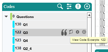
Initially, these may be confusing but as you work in the system you will quickly find these to be well worth it:
- Hovering over a question and clicking the quotation icon lets you see the set of responses to said question.
- Responses are indexed automatically
- Individual documents with qualitative responses are created and linked to your participants
Once you have fully coded your data, you also gain the ability to view what themes seemed to come up across your questions. Luckily, this is super easy and doesn’t require any additional work on your end. To do this:
- Click the Analyze tab
- Click Code Charts
- Click Code Co-Occurrence
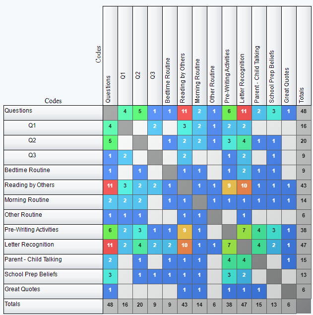
From here, you will find your set of questions on the left. Moving along the row of there will give you the frequency for each code’s overlap with your question. As such, larger values indicate a theme emerging more often for any given question. There is also a toggle in the upper right area of this chart labelled ‘Include Overlapping Excerpts’ which we often encourage users to leave on. Deactivating this toggle will change the display you are looking to only count codes that exist within the same excerpt as opposed to excerpts that overlap or directly border each other. Clicking on a cell will give you the specific text where these codes overlap:
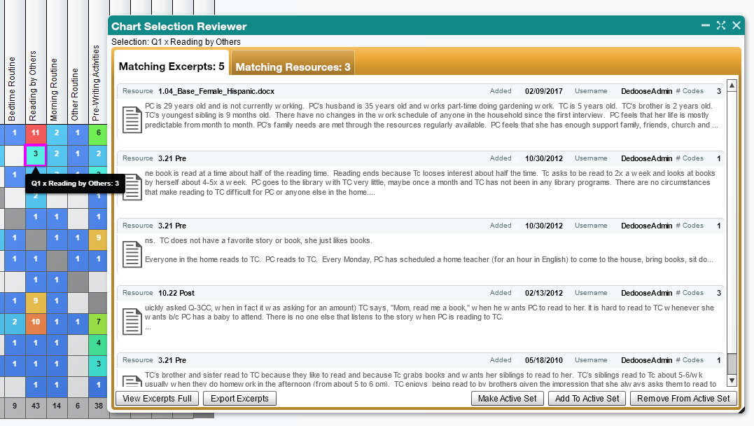
We can pull up excerpts in this way from any of the charts and graphs in Dedoose. Every bar, cell or piece of a pie chart is ‘live’ and clicking on it will bring up the associated excerpts. This makes for quick review of these smaller subsets of the overall data.
Something to note as well is that the absence of expected data can be just as important as a high count. Did you expect one of your questions to have a specific theme come up often, but this chart shows that it didn’t? Did another theme come up often instead? These are all questions you will want to ask yourself when viewing the code co-occurrence chart and really any qualitative and mixed methods data analysis tool or feature. (A free tip from one of our researchers!).
That is about it! You can export these overlaps, make them into a data set, or really anything else you can do when using Dedoose’s analytical features. You can find more information on the various charts and graphs available in Dedoose in our user guide, available here: https://www.dedoose.com/userguide
Check out a webinar! If you’re new to Dedoose or just need a refresher of some functions you may not have used in awhile our free webinars are a great opportunity to learn more about Dedoose, how it works and what it can do for you. Click on over to the events page to see when the next one is. https://www.dedoose.com/about/events
As always, we’d love to hear what you think! Suggestions, comments or even criticisms (we can take it) are always welcome. We firmly believe our users are the best resource for improving our application so please send any thoughts you’d like to share to support@dedoose.com. Want to learn more about analyzing qualitative and quantitative data in Dedoose? Check out our blog, "Importing and Analyzing Twitter Data with Dedoose!"