
Article: Dedoose 8.1: New Charts and Other Improvements
Tags
- All
- Training (4)
- Account Management and Security (9)
- Features of Dedoose (9)
- Dedoose Desktop App (1)
- Dedoose Upgrades and Updates (5)
- Dedoose News (6)
- Qualitative Methods and Data (11)
- Other (5)
- Media (5)
- Filtering (5)
- Descriptors (10)
- Analysis (22)
- Data Preparation and Management (20)
- Quantitative Methods and Data (5)
- Mixed Methods (20)
- Inter Rater Reliability (3)
- Codes (26)
In the second article covering the new features of 8.1, we’ll be talking about our new charts and finishing it off with some of the quality of life improvements we’ve also made. Without further ado, let’s dive right into the new charts and what they mean for your analysis.
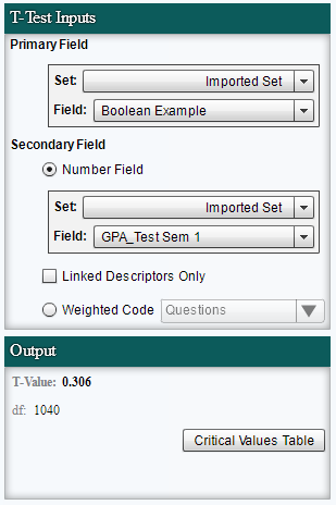
The first chart we’re going to talk about is the Descriptor T-test chart. This is a test meant to determine if there exists a significant difference between two groups relative to a number type field. This chart requires an option list field with only two variables as well as a number field or a weighted code.
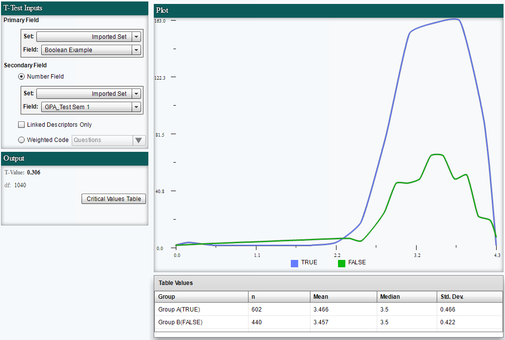
When using this chart, the first idea you’ll want to be familiar with is the null hypothesis. The null hypothesis states there is 'nothing going on' that we can support statically or, to put it another way, we have insufficient evidence to support that what is happening is anything but what would be expected by chance. With these data points we construct the chart and can then determine if we have statistical evidence to support the conclusion that there is a difference between these two groups with regard to the number field or weight.
On the left side of this chart we have the controls for what data are being displayed. Our Primary field needs to be an option list with ONLY two options, the secondary field must be a continuous numerical field or a weighted code. Below that you may notice the ‘Output’ window. Here we can see the T-Value and “df” which stands for degrees of freedom. The T-Value will help us determine if we have a statistically significant result when compared to the critical values table for the particular degrees of freedom. These charts can be complex and require a working knowledge of the kind of analysis they provide, if all this is striking you as word salad with little to no meaning we suggest a review of common quantitative analysis tests and their purposes.
Next up is the Descriptor Analysis of Variance (ANOVA) test. While new to Dedoose, some of you may already be familiar with ANOVA charts. Similar to the t-test this chart is something we use to reject the null hypothesis, assuming we have a statistical reason to, although with this chart we are able to see differences across more than two groups.
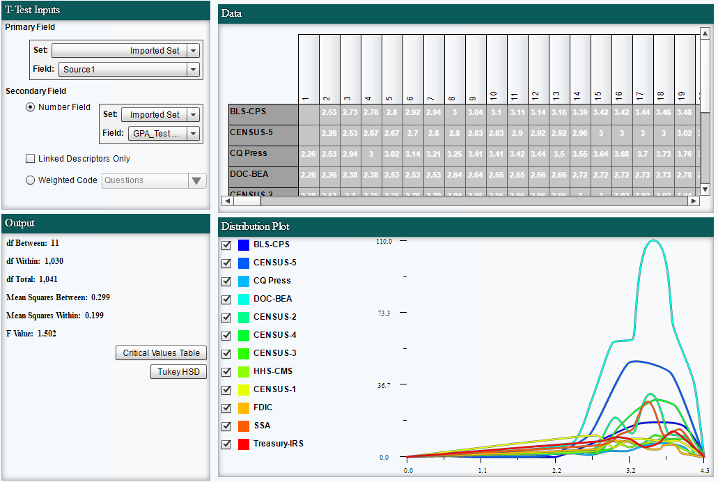
For this chart we’ll need an option list field with more than two options, as well as a continuous variable (Number type field) or weighted code. While this can help us determine if we have evidence to reject the null hypothesis it doesn’t tell us which among the groups are different from each other. That is, an ANOVA test can tell us if the results are significant overall, but it won’t tell you where those differences actually exist. For example, two might be the same but the third is different. Or, all three groups might be significantly different from all others. To answer those questions, we need to do what are called post-hoc tests. While there are different post-hoc tests to select from, in Dedoose we employed Tukey’s Honest Significant Difference Test (HSD).
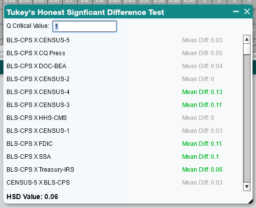
Just like our T-Test, this chart provides some output data. The degrees of freedom may be familiar from our paragraph on the previous chart, although now we have even more. The degrees of freedom between these groups, the degrees of freedom within these groups and finally the total degrees of freedom in all groups. We also have outputs for the mean squares of the data, averages of the squared values between the groups and within the groups. Finally our F Value, similar to our T-value of the t-test chart, which we can use to determine if we have statistical evidence to reject the null hypothesis. We also have the button to take us to a critical values table, as well as the Tukey HSD button. To use this, take the critical value you received in the linked table, click Tukey HSD and enter the value. If the difference between the means of the two groups exceeds HSD, the groups are considered ‘honestly’ significantly different.
Our third new chart is the Descriptor Field Correlation chart. Here we’ll need to select two number type fields to populate the chart. One will be designated the x axis and the second the y axis. This chart makes it fairly easy to see if there is a significant correlation at a glance. The image below should help you understand how to determine this correlation, or if it exists at all. In this example, it is quite clear visually that we have a strong negative relationship. That is, when one value increases the other tends to decrease.
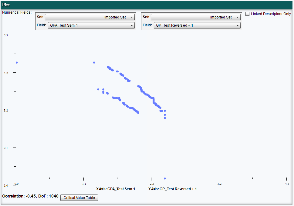
In addition, we can use Pearson's correlation coefficient provided at the bottom of the chart to report the results from a statistical perspective.
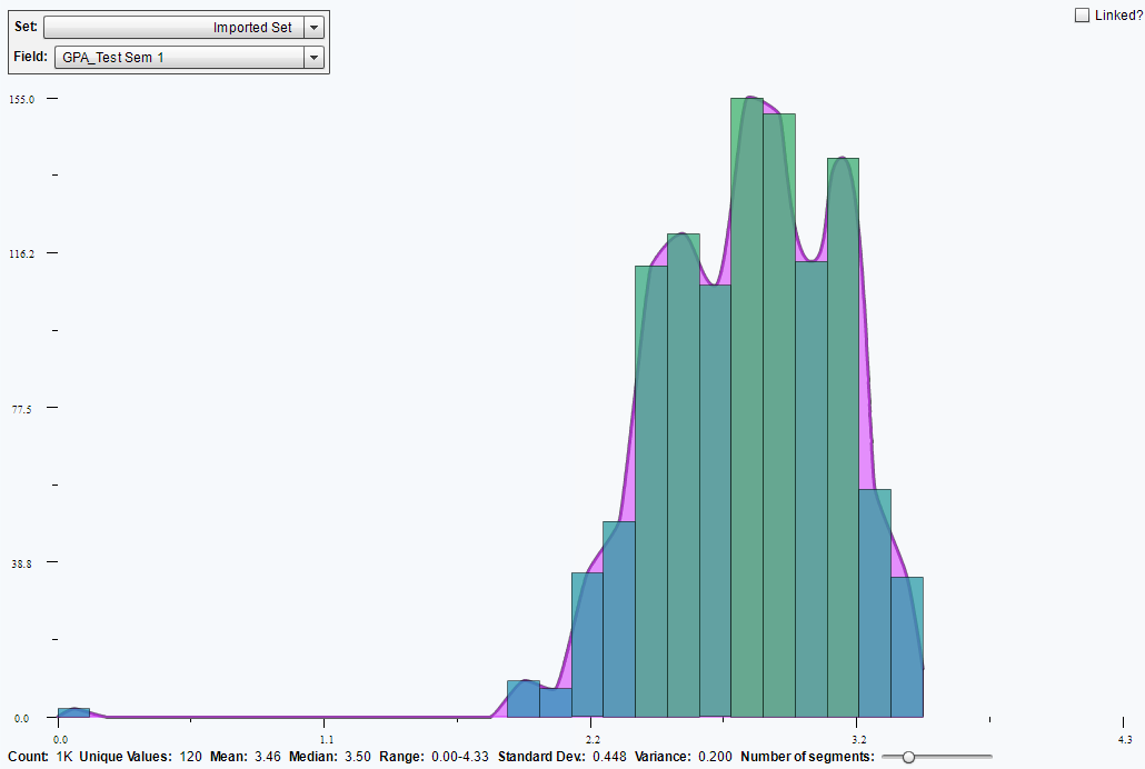
Bringing up the rear is the Descriptor Number Distribution Plot. This presents a number type field as distributed across the range of your participants. The x axis are the values they provided and we can examine the distribution to get a visual sense of how the individuals cluster--the y axis representing those values. This is a quick way to get an overview of a number type field and basic psychometric properties of the distribution presented along the lower part of the chart. Note, you can also select the number of segments to break out your values into ranges. This helps to understand at a glance how many of your participants fall into a certain range of a numerical field.
We also have a series of improvements meant to make life easier as you move around Dedoose. As these require little explanation we'll simply offer them up as a list.
- Shift selecting multiple objects is now possible
- Make Set/Add to Set/Remove from Set added to Media Workspace
- Ability to Change Descriptor Field Type is now possible
- PDFs can be exported (but do not retain coding or memos)
- Administrator disabled user accounts are no longer charged to large group billing accounts
- Image excerpts preview properly
- Project chart optimization
- Descriptor searching
- Excerpt export sort options
- Document export sort options
All these improvements are meant to help make the Dedoose app faster, more feature rich, and more intuitive. Also, keep in mind that many of these improvements started as user suggestions, so if you have an idea please let us know and it might just make it into our next build. We are always trying to improve and evolve Dedoose and our users have always proven to be a key resource for doing so. We are, after all, doing our best to create this application for our user community, please let us know what you think, where we can improve, and whether or not Bruce the Dedoose Moose is welcome at the end of these blogs. Bruce is laying low for this blog, travel takes it's toll, but keep those eyes peeled for a Bruce the Dedoose Moose update in the near future