
Article: Code Frequency Descriptor Bubble Plot & Your Qualitative Data Analysis
Tags
- All
- Training (4)
- Account Management and Security (9)
- Features of Dedoose (9)
- Dedoose Desktop App (1)
- Dedoose Upgrades and Updates (5)
- Dedoose News (6)
- Qualitative Methods and Data (11)
- Other (5)
- Media (5)
- Filtering (5)
- Descriptors (10)
- Analysis (22)
- Data Preparation and Management (20)
- Quantitative Methods and Data (5)
- Mixed Methods (20)
- Inter Rater Reliability (3)
- Codes (26)
3/1/2013 Mixed Methods Charts We have had requests from users on Facebook and Twitter for an explanation of charts, graphs, and bubble plots in particular. Here is an in depth look at one of our bubble plot!
Why should I use bubble plots in my qualitative data analysis?
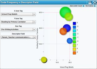
CODE X CODE X CODE X Descriptor Bubble Plot This bubble plot looks at the FREQUENCY of how three codes were applied (selected by you) against your chosen descriptor field. This is most helpful if you used the selected codes only once per piece of media (e.g. document, audio file, video file). The second bubble plot, which we will discuss in a future blog, deals with the weight associated with the codes you select. Either way, both bubble plots offer quick access to your qualitative data as well as an effective way to tell your story in presentations.
So, let’s get started!
Step 1: Set up your data
To begin you must import your media files (e.g. documents, videos, audio), excerpt and code your data, and add your descriptors. This bubble plot will pay off, but only after you have put in the work to set your project up correctly.
Step 2: Go to the Analyze Interface

Step 3: Select the chart
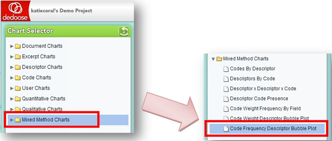
Open the 'Mixed Methods Charts' folder on the right hand of your screen under the Chart Selector section. Then, click on the 'Code Frequency Descriptor Bubble Plot.'
Step 4: Select your codes and descriptor
Select the descriptor field (which will comprise the different ‘bubbles’) as well as the three codes: the X Axis, Y Axis, and Size Tags that you want to define the dimensions of your plot. Our example data come from a study on people’s feedback about what they look for in a hotel . In our illustration, we will plot ‘Income’ group across the service, luxury, and cost codes.
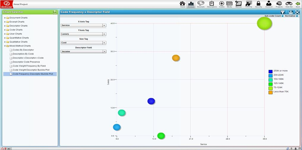
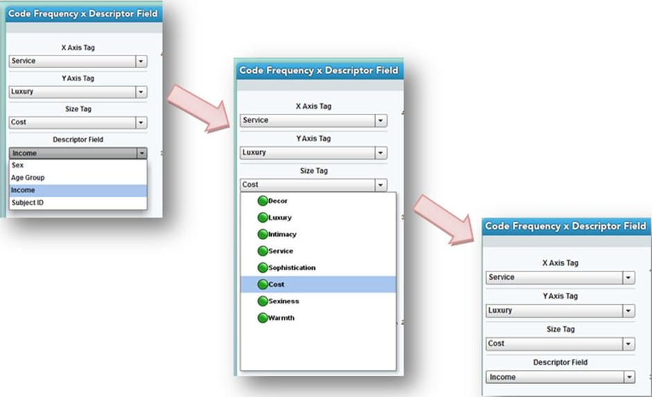
So what does this mean? Again, our example, from a study on the hotel characteristics reported as relevant in hotel selection across age and income level. The bubbles represent different annual income groups. The size of the bubbles represents the frequency with which the ‘Cost’ code was applied to excerpts within each sub-group (descriptor field). The X and Y axes represent the frequency with which the ‘service’ and ‘luxury’ codes were applied respectively.
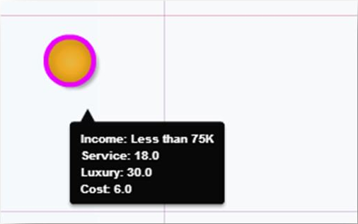
NOTE: If in your data you used one code ONCE for each piece of media this plot will be very helpful. If you used codes multiple times (which is often the case), or if you have used a weighting system in your analysis then we suggest using the bubble plot that shows Weight, rather than this plot that shows frequency.
The text analysis behind the visuals Another great feature of this bubble plot (as is the case with virtually all Dedoose charts, tables, and plots) is that you can easily see the data behind the image. In this plot, simply click on the bubble of your choice and you will see a pop up that displays all excerpts associated with that bubble. This allows you not only to see the relationship between these codes and this descriptor, but also exactly what participants are saying as well.
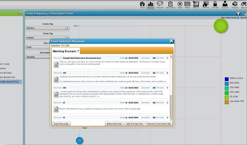
You can now open, explore, and modify coding on these excerpts, export them if the time is right to use them in your writing (or to review off line), or you can look a little deeper by filtering by these excerpts.
Digging a little deeper
To filter by these excerpts, click on ‘Make Active Set.’ Once you have filtered here you will see the ‘Data Set’ icon in the features bar located at the top right of your screen turn RED to indicate you are looking at filtered data and all subsequent analysis will be only on that subset of excepts. Now you can go through other charts and see how they look through this filter. And, when you have a set active you will see the toggle icon displayed on the top right hand side of the visualization. This will allow you to toggle back and forth between the total data and your active set. You can also ‘Add to Active Set’ if you wish to open up the excerpts from another bubble and want to include the data represented by this new bubble in your active set.
Step 5: Exporting your charts
You can export your bubble plot as a whole as a PDF or as an Excel file. To do this, go to the top right hand corner of your screen and click on the export icon. You will then be able to select the type of file you wish to use for your export. You will have the option to save the file anywhere on your computer so you can use it in any and all future presentations.
All Done! Using charts, graphs, and plots can bring your research story to life. Stay tuned for other in-depth looks at the Analysis Workspace.